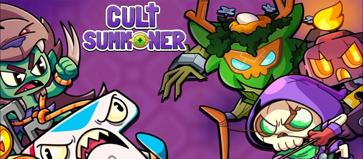

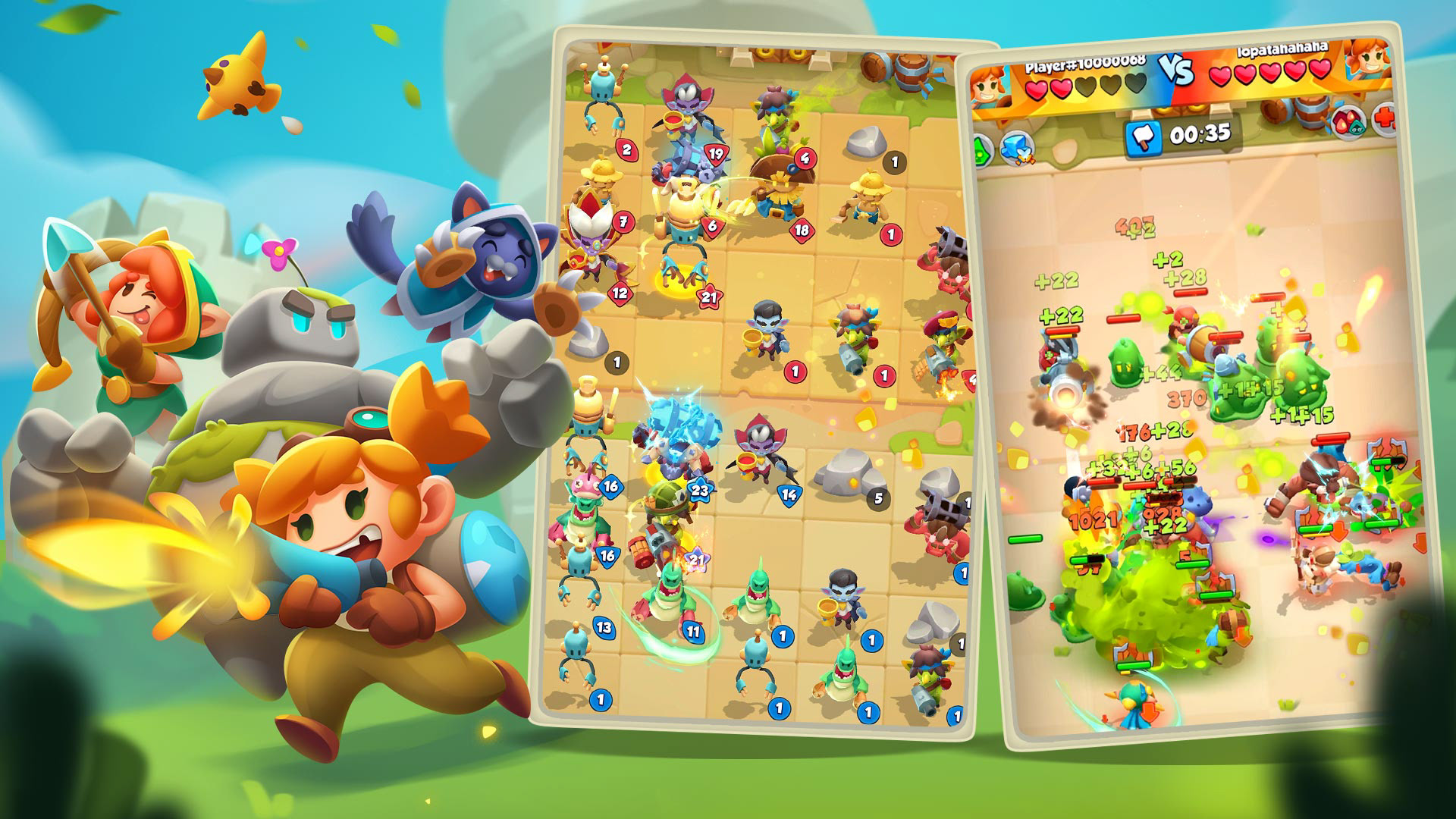
Cult Summoner is a mobile auto-battler roguelite where players summon, merge, and position units across short combat encounters while building long-term progression.
Because the game combines multiple-layered systems, auto-battle, merging, card collection, and meta progression, the main UX challenge was ensuring players could understand and act on information quickly within short mobile sessions.
I worked as a Game Designer who also did UX and UI design across core gameplay flows, focusing on clarity, familiarity, and strengthening player motivation through feedback and progression visibility. I worked closely with the game’s UI/UX artist, providing direction throughout development, while they produced the final art assets.

Players needed to quickly interpret several overlapping systems:
• Automated combat with multiple units and effects• Room-based progression across a run
• Card collection and upgrades
• Meta progression across runs
Early testing showed that presenting too much information simultaneously reduced player confidence and slowed decision-making.
The design goal became: support fast decisions while preserving system depth.

To guide interaction design decisions, we analyzed games that communicate layered systems effectively on constrained screens.
Collection and card readability references:
• Black Deck
• Invincible: Guarding the Globe
• Black Deck
• Invincible: Guarding the Globe
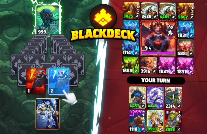
Black Deck
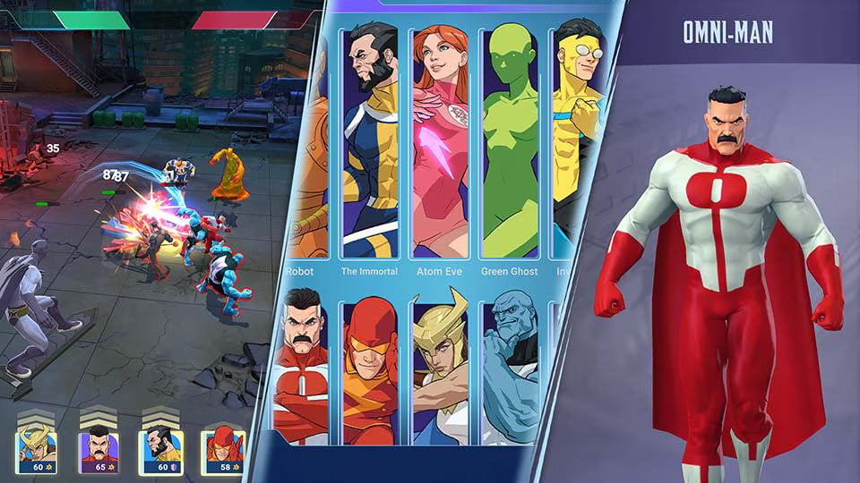
Invincible
Auto-battle and battlefield clarity references:
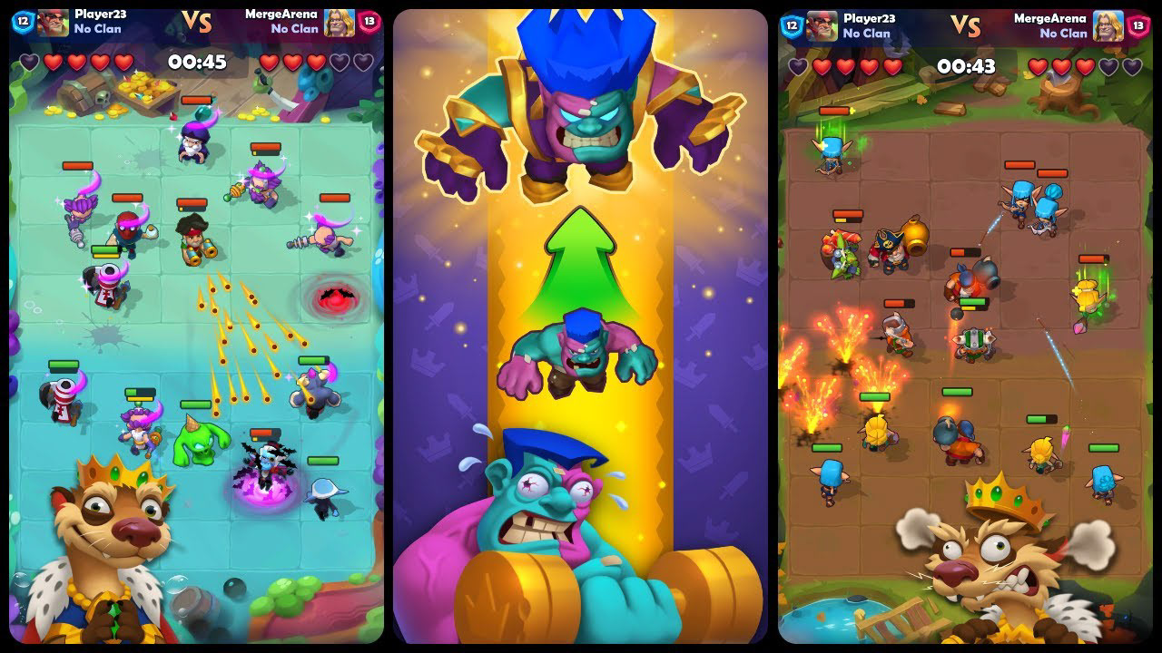
• Despot's Game
• Warcraft Rumble
• Despot's Game
• Warcraft Rumble
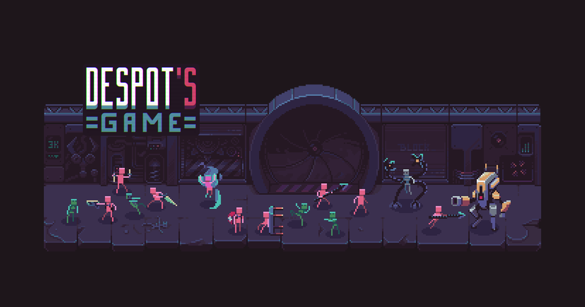
Despot's Game
Warcraft Rumble
Merge and run-based progression references:
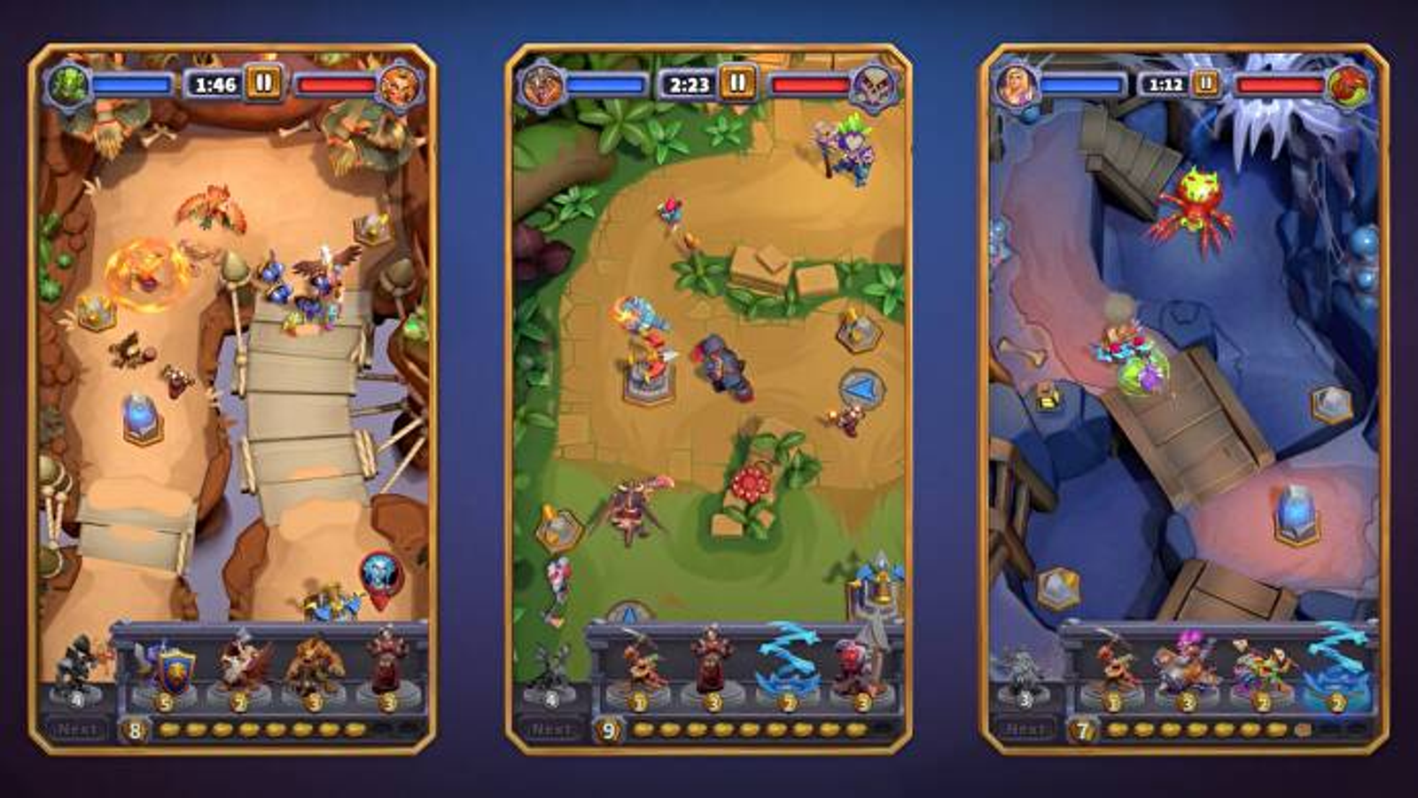
• Merge War
• Castle Duels
• LUDUS
• Merge War
• Castle Duels
• LUDUS
Merge War
Castle Duels
LUDUS
Navigation and menu clarity references:
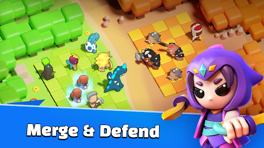
• Tap Force
• Tap Force
Thematic inspiration:
• Cult of the Lamb
• Cult of the Lamb
Tap Force
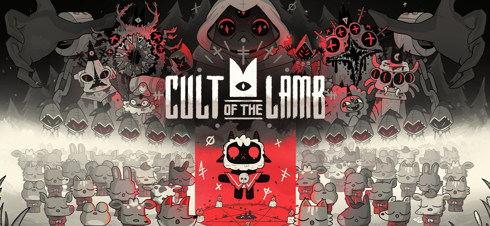
Cult of the Lamb

This flow highlights how players move between short-term gameplay decisions and long-term progression systems.
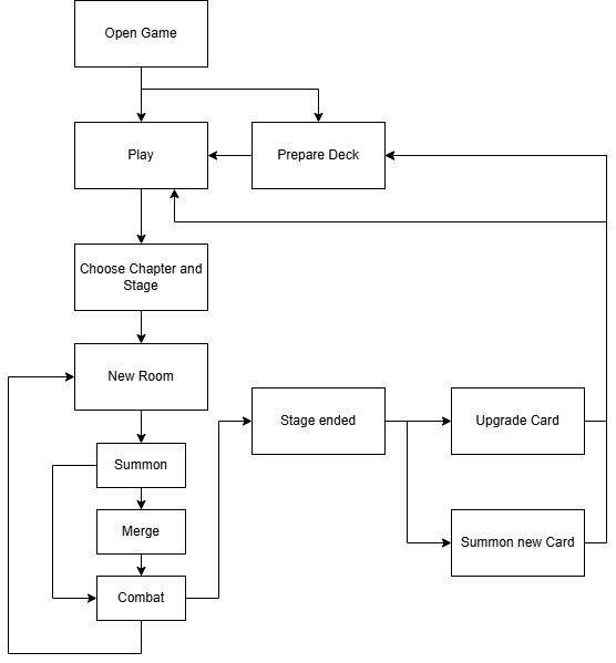

The initial menu attempted to surface every system at once: currencies, quests, equipment, base, store, chapters, cards, patrols, challenges, and more. Testing showed that this created hesitation and reduced clarity about where to start.
Changes
• Prioritized the primary action (Play) visually and spatially
• Moved secondary systems into deeper navigation layers
• Deferred long-term systems (quests, patrols) from early player exposure
• Removed several mechanics from the beta to reduce cognitive overload
• Moved secondary systems into deeper navigation layers
• Deferred long-term systems (quests, patrols) from early player exposure
• Removed several mechanics from the beta to reduce cognitive overload
This created a cleaner hierarchy and a clearer onboarding path.
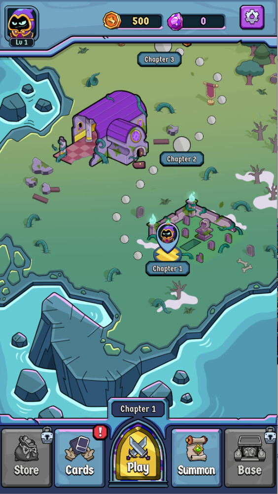
Wireframe Main Menu
Wireframe Stage Selection
Wireframes
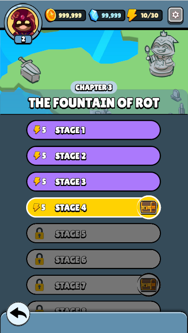
Final Main Menu
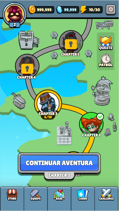
Final Stage Selection
Final screens

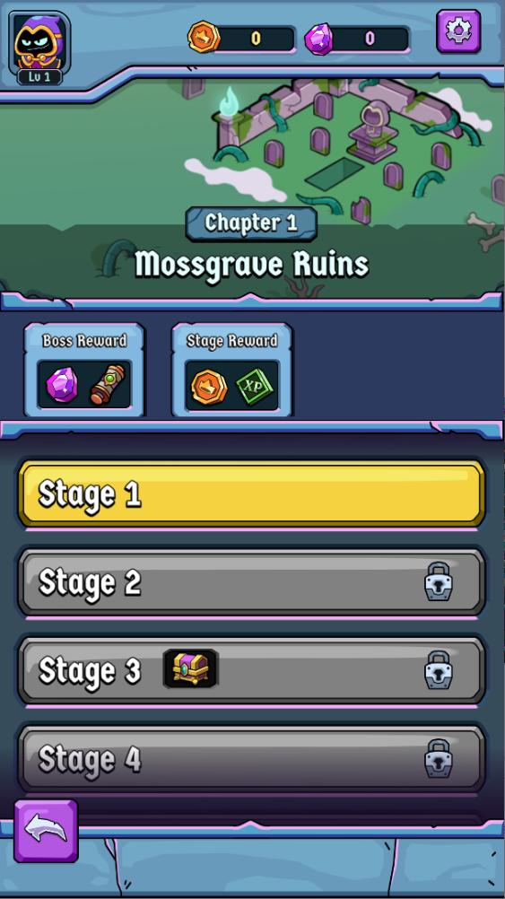
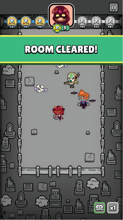
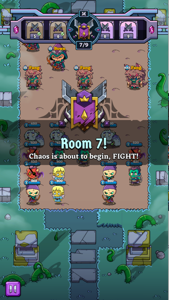
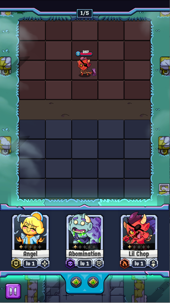
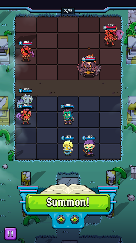
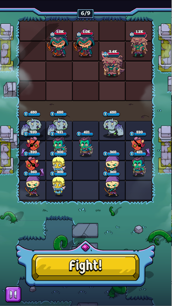
Originally, the combat UI displayed the entire room progression timeline at all times. Testing showed that this distracted players from making immediate decisions.
Changes
• Replaced full timeline with simple room progress indicators during combat
• Showed full progression context only between encounters
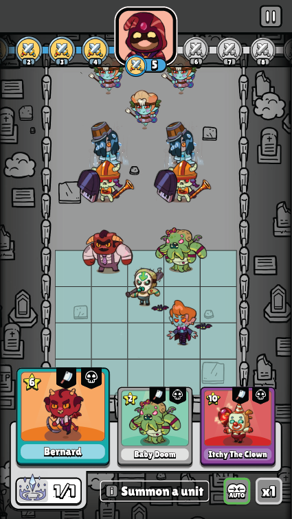
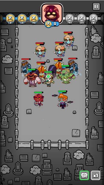
• Simplified summoning screen information density
• Strengthened spatial separation between ally and enemy zones
• Showed full progression context only between encounters
• Simplified summoning screen information density
• Strengthened spatial separation between ally and enemy zones
This reduced visual noise and helped players connect actions to outcomes.
Wireframe of room progress
Wireframe of summon with choices
Wireframe of combat
Wireframes
Final Room Progress
Final Summon with Choices
Final Summon Random
Final Organizing troop moment
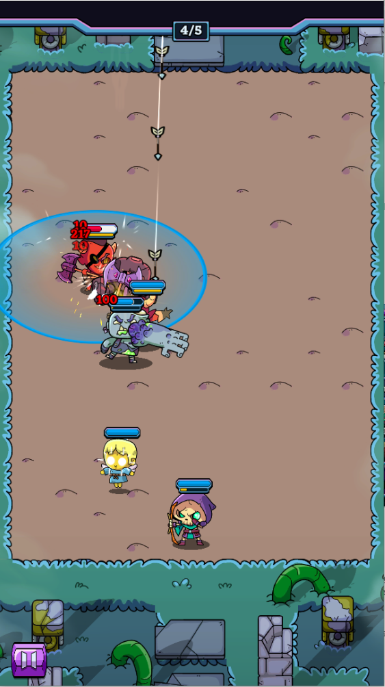
Final Combat
Final screens
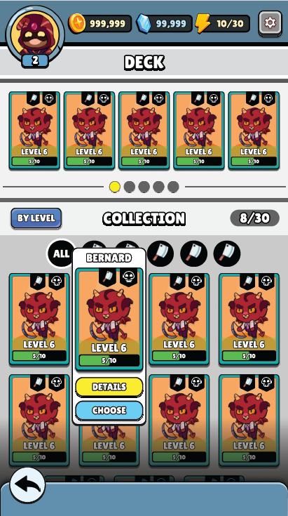
Wireframe Card Collection
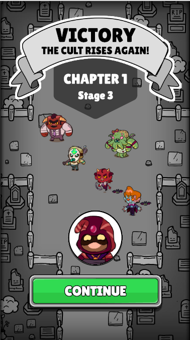
Wireframe Victory
Wireframes
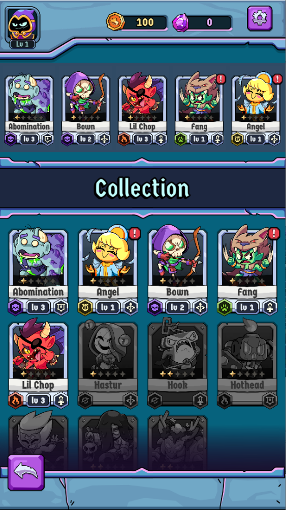
Final Card Collection
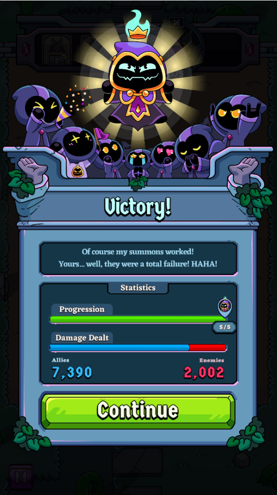
Final Victory
Final screens

The open beta is available on Android